top of page
My Slides
To get access to my google presentations on my context, research, planning, production log, evaluation, and smaller graphic design projects please click on the image below! On the website below you can find all my year 12 work in better detail:

Fundementals
Of Deaign
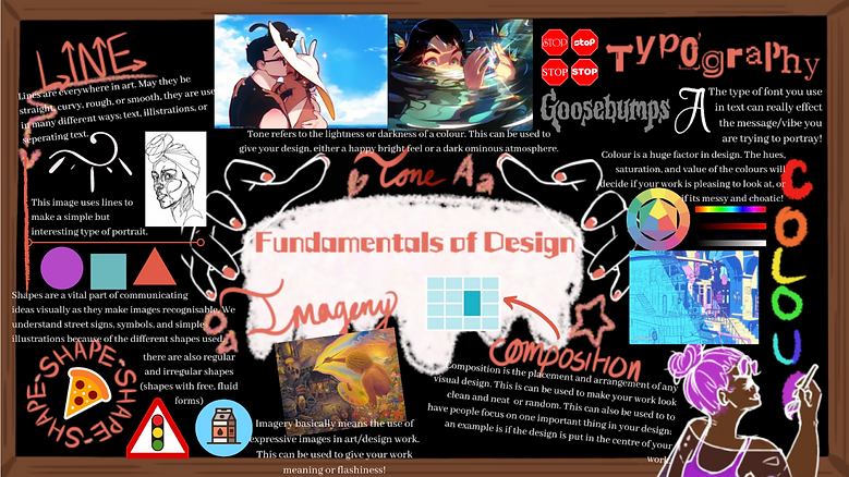
Researching the fundamentals of design was one of the first things I had to do. It helped me understand what makes up a piece of art work, and what needs to be considered when designing anything.
I looked into Composition, Imagery, Typography, Line, Shapes, Tone, and Colour; describing what they were and giving examples to better show my understanding.
Line Assignment
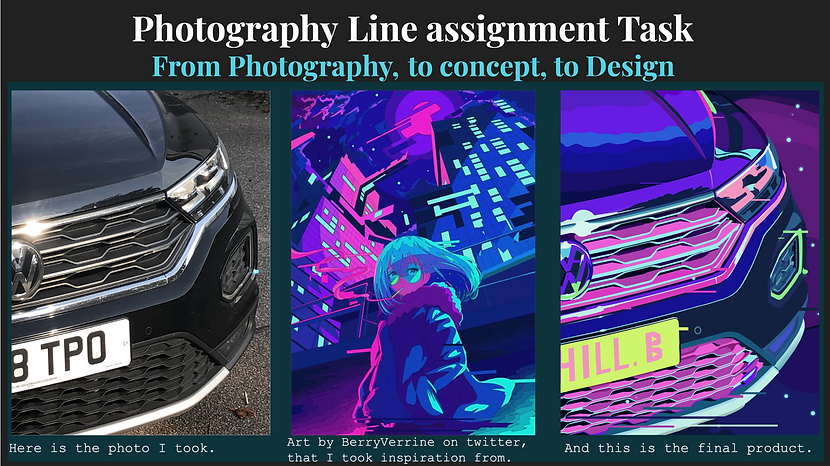
I really enjoyed doing this short project. Here we had to take a photograph of something interesting in the scenery around us, then we had to go into illustrator and use lines to draw it, using another artist as inspiration.
I took a picture of the front of a car; because I imagined how I could artistically re-draw the photo into something a lot more colourful and interesting, I decided to choose it as my final image. Then after searching social media for a good artist, I came across BerryVerrine and this very interesting art piece. Because it comprised of very noticeable straight lines, and an attractive colour palette I stuck with her as inspiration and produced this as my final product.
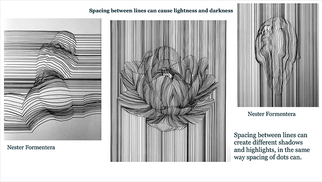
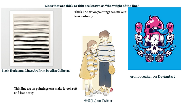
Line Fundamentals
As sort of a continuation to my Line Assignment, I did a little bit more research on the fundamentals of lines in design. I looked at the different types of line and how it can be used; things like dotted lines, curved lines, line art, straight lines. I even took it further and looked at line textures.
With all of this information, I pared it with different artists' work as well as my own to further show my understanding.
Colour Theory
Moving on from my line assignment, I went onto researching about colour and the colour theory. This assignment was supposed to be pared with my Game Design work, where I also experimented with colour.
The main focus of this research was the different formulas you could use to fine colours that where harmonious. Formulas like Triadic, Monochromatic, complementary/split complementary, analogous, and tetradic were all popular and guaranteed ways of making sure your colour palette is pleasing.

My Slides
To get access to my google presentations on my context, research, planning, production log, evaluation, and smaller graphic design projects please click on the image below! On the website below you can find all my year 12 work in better detail:
bottom of page